3 Do's and Don'ts of Logo Design for Service Businesses
In this short video, I'm covering key tips on logo design for service businesses.
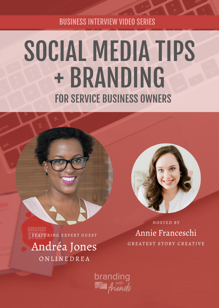
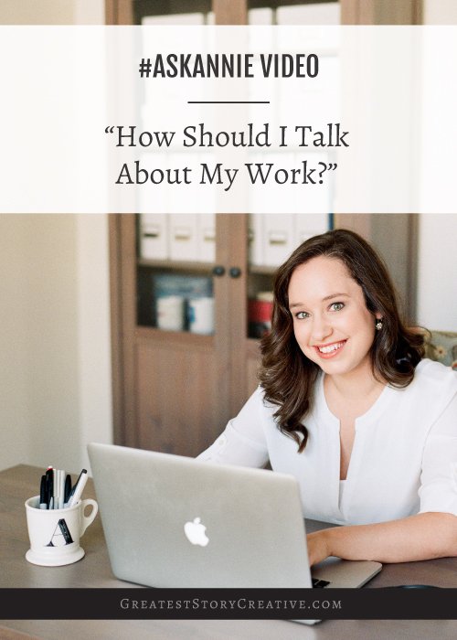
This is Episode 4 of my Facebook Live series, #AskAnnie. You can watch the video episode above or read on for the transcript version. Like our Facebook page to catch these broadcasts live!
Hello! Hello and welcome to another episode of #AskAnnie. This is a regular Facebook live series I've been doing to tackle your common questions around branding for service businesses.
Today we're back with an episode all about logo design.
I get lots of questions about logo design, a lot of them have to do with things like, "I know exactly what I want on logo, let me tell you." Now, I thought it would be a great opportunity to do a episode all about the do's and don'ts of logo design.
So what are the do's and don'ts?
I picked three today that I think come up a lot. So I want to talk about some of those common things that people think that they need to do in their logo and how to fix them.
What should you be focusing on? What are those do's and don'ts of logo design? So today we're going to tackle three of those.
DON'T use your favorite color.
So you're having a logo created and you go, "I love purple. Purple is my signature color. I wear it all the time." The problem with potentially using your favorite color is that your favorite color may not be the best color choice for your brand. Right? So what if your audience is mostly male and purple, especially the particular shade of purple you like, is really feminine? Is that going to be the best choice for your audience, even if it's something that you personally like a lot?
You're going to start to hear this through all the do's and don'ts today, that our logos, when we create a logo for our business, it really has to work for our audience. It needs to resonate with us and tell our story, but our story in a way that our clients, our ideal people that we want to work with, that they can see and receive it. So right now, when we just use our favorite color, we're not making sure that that color is the right color choice.
DO use your meaningful colors for your audience.
So instead of using just your favorite color, I want to challenge you to use meaningful colors for your audience. So that involves knowing who your audience is, how old they are, sort of an age range for them.
Are they men and women?
Are they just women?
Just men?
Is it sort of you know mostly women with a few men?
How does it really breakdown and are the colors that you're choosing going to work for that audience?
Is it going to fit the tone of your business?
Is it telling the right story, not just your story?
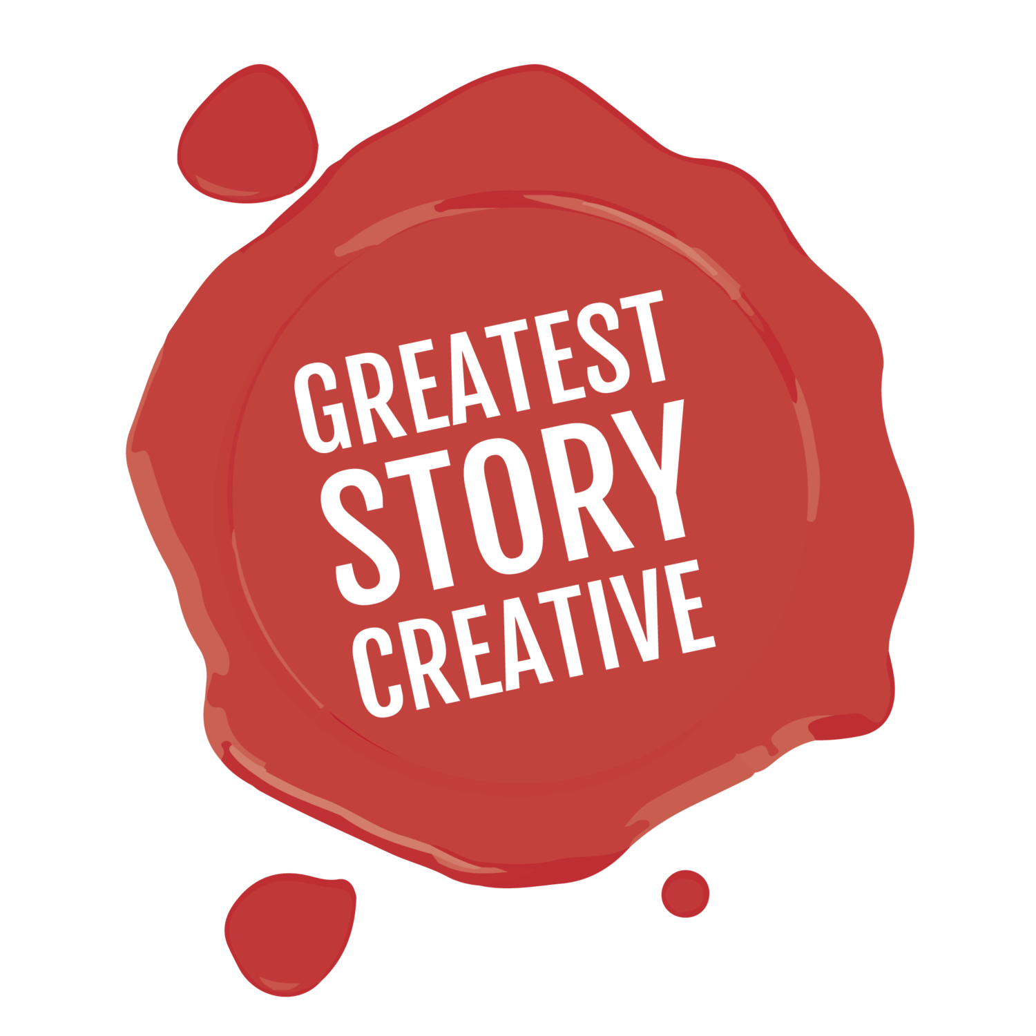
So, even though you might have a signature color, you have to entertain the notion that it might not be the best choice for your logo. I also encourage you to go and research what is called color psychology. So, looking at color psychology theory, you'll start to see that there are meanings behind colors. So like the Greatest Story logo for example, that's hanging out up here. It's red. It's meant to evoke passion and a little bit of drama and little bit action. Because I'm here and I'm really all about trying to get you to take action and have confidence in your business and have that passion for your business to share your stories. So that's really done in a very deliberate way. Now, red's not the best fit for every business. I don't even use it as much as just for that signature look. I don't use it all the time. I use black and whites, as you're seeing on my polka dots today. But colors all have meaning.
So are you picking the right color? It can't just be the color that you love to wear. Right? Because what you love to wear doesn't always represent your business and it doesn't tell your ideal clients that they've come to the right place necessarily. So it might, which is when we call it a big win. When your signature color is a great psychological choice for your logo and it fits your business and the tone you're trying to strike. But that doesn't happen every time. So we want to keep that in mind. So, let's not use our favorite color.
DON'T use your favorite animal or symbol.
The other thing that I see a lot is people who are saying things like, "well, I love butterflies." So like your favorite animal, your favorite symbol, or something that has like a lot of personal meaning for you. And it's sort of a similar issue with the color thing. Right?
That if you pick something that's very personal to you, is that going to be as meaningful or even in any way reaching the audience that you have? Are they going to get it? Right? So it can be a lot of work for them to get it. Like, to get why butterflies are in your logo, when maybe you're a tax attorney?
We need to make sure that it's going to be something, if you're going to use an image, it's going to be something obvious and it's great if it connects to you. A lot of the work we do is try to pick things that resonate with you, but also resonate with your audience. But you don't want to pick something so obscure or so unrelated that it's just related to something that you care about in your personal life. Because that is not going to tell the story you want to tell people in your business. It's not going to say the most important story, which is how do you help other people?
You're not a hero of your business, your clients are.
You are just there to be their guide. So what imagery are you using that's related to your business in your logo?
DO use imagery that relates to your business.
We want people to get what you do. It's less important that they know that you've collected butterflies for five-ten years. My grandmother collects giraffes for example. Maybe she's made both of her businesses have giraffes in them. But that's not always the best way to go, because it can be misleading to your clients. It can be confusing to them and it can, in fact, make it harder to tell your story, when you were trying to make it easier.
Your story needs to be presented in a way that's going to show value and how you solve problems for your clients, not just things that you personally care about or how great you are. We know you're great, but this isn't about that. It's about why people are going to care, because it's going to make their lives great. So we have to get that across. And so when we pick things like imagery, that relate more to our business and less of the things that we personally like, we're going to accomplish that more easily. So we're going to ditch our favorite animals and symbols unless they are also imagery that relates to our business.
DON'T use your favorite scripty font.
Last but not least in sort of these three do's and don'ts is another don't that I see a lot, in particular with women who are branding themselves, is using your favorite scripty font. So you know what I'm talking about ladies with those loopty-loos, and the cursive, and the calligraphy. And that is a great fit for a lot of businesses. You know if it's something that's very feminine, it could be an excellent choice. But you are going to watch out for readability in those cases. But scripty fonts, just like colors, they're going to have feelings.
And you know the straight up and down font. A sans serif, a very clean, modern looking font that you see on the computer. That's gonna have one feeling versus a serif font, which is what you see up here in the #AskAnnie hashtag. So you're going to have different connotations. You want to be careful that the font you choose is readable and that it fits the tone of your business. So you want to make sure it's gonna fit that tone and fit the industry that it's in.
You know if you're an app and you pick a calligraphy font, is that going to make sense to your audience? So you you're hearing me all the way through, I hope, which is just to say, "hey, if your audience isn't getting this, guys, it doesn't matter." It doesn't matter that you're using your favorite font, your favorite anything because it's not about you. It's about them. You know if they're not being served by what you're doing, if they're not being invited in, if you're not telling them how you're going to solve their problems, they don't care. Because they're the hero.
DO use fonts that fit the industry and tone of your business.
So this is how we're going to serve them. We're going to pick a font that's going to fit our industry and fit the tone of our business. If our tone is very feminine and whimsical, than a script font might be exactly what the doctor ordered. If it is very trustworthy and sort of loyal and dependable and calm than a script is not going to tell that story as well as maybe a very clean uppercase, sans serif. Like a very clean, modern font. So just to give you a couple useful cases of how this all works.
So just to recap here, we are not going to choose our favorite color. We're going to choose meaningful colors that fit our audience and tell them a story, fitting the tone of what we're trying to say. We're not going to use favorite animals or symbols unless that meaning is going to be obvious to people, unless it's going to be something they're going to recognize and you're going to appreciate, If it's going to help you tell the story. Because we're going to use imagery related our business and of course, we're not just going to go for our favorite scripty font. We're going to pick a font that fits our industry and tone. So those are some of my favorite do's and do not please in your logo design.
A QUICK RECAP:
Then it comes to designing a logo for your service business, here are 3 key do's and don'ts.
DON'T use your favorite color; DO use meaningful colors for your audience.
DON'T use your favorite animal or symbol; DO use imagery that relates to your business
DON'T use your favorite scripty fonts; DO choose fonts that fit the tone and industry of your business
I appreciate you tuning in today and if you're watching this on the replay, I appreciate you too. I'm actually talking about logo design this week. So, tomorrow, I'm going to be here in Raleigh-Durham teaching Branding with Annie. Our class tomorrow is on logo design. We do have a few seats left, so I would love for you to come if you're seeing this. Come hang out with us over lunch tomorrow at The Frontier. You can check it out at brandingwithannie.com. I am also offering this as an online class this week. So it's this Thursday at 12:30 and you can sign up as a webinar both at brandingwithannie.com. So if you have other questions about logo design, throw them here in the comments. I will keep an eye out for it and maybe you will spot it again in a new episode of #AskAnnie.
But until then I encourage you to stay awesome, get out there, and show your value, tell your story and I'm here to help you grow your business. So have a good one guys and thanks for watching #AskAnnie.


Further reading about logo design:
7 Killer Tips for Logo Design (Mashable)
9 Powerful Tips for Effective Logo Design (Designhill)